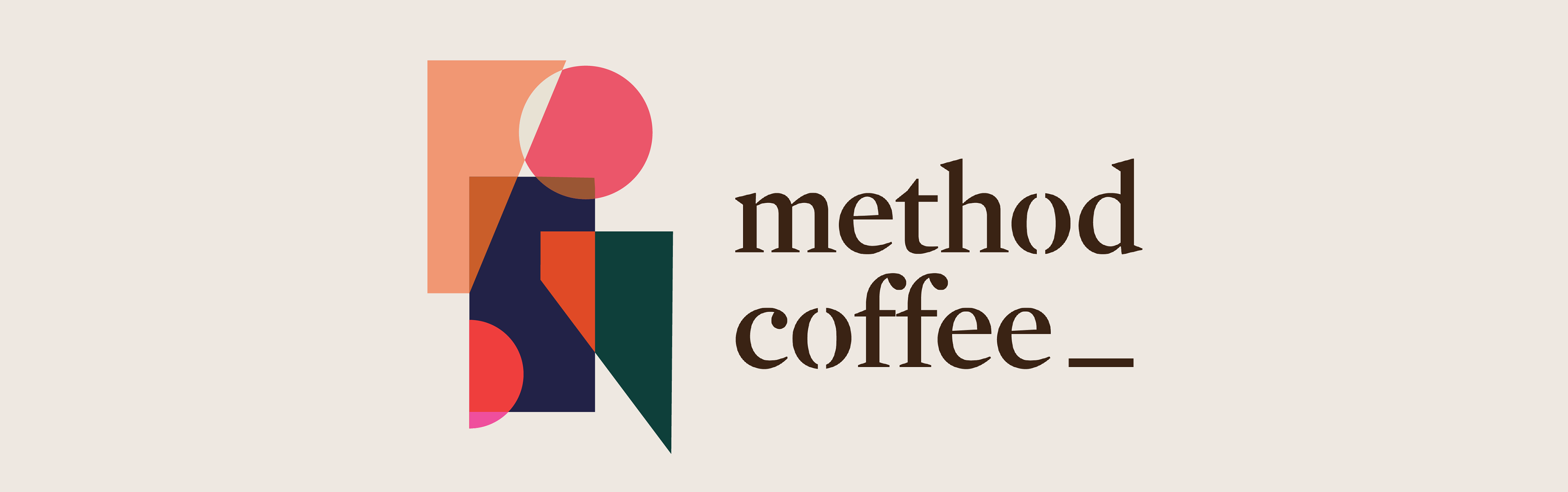
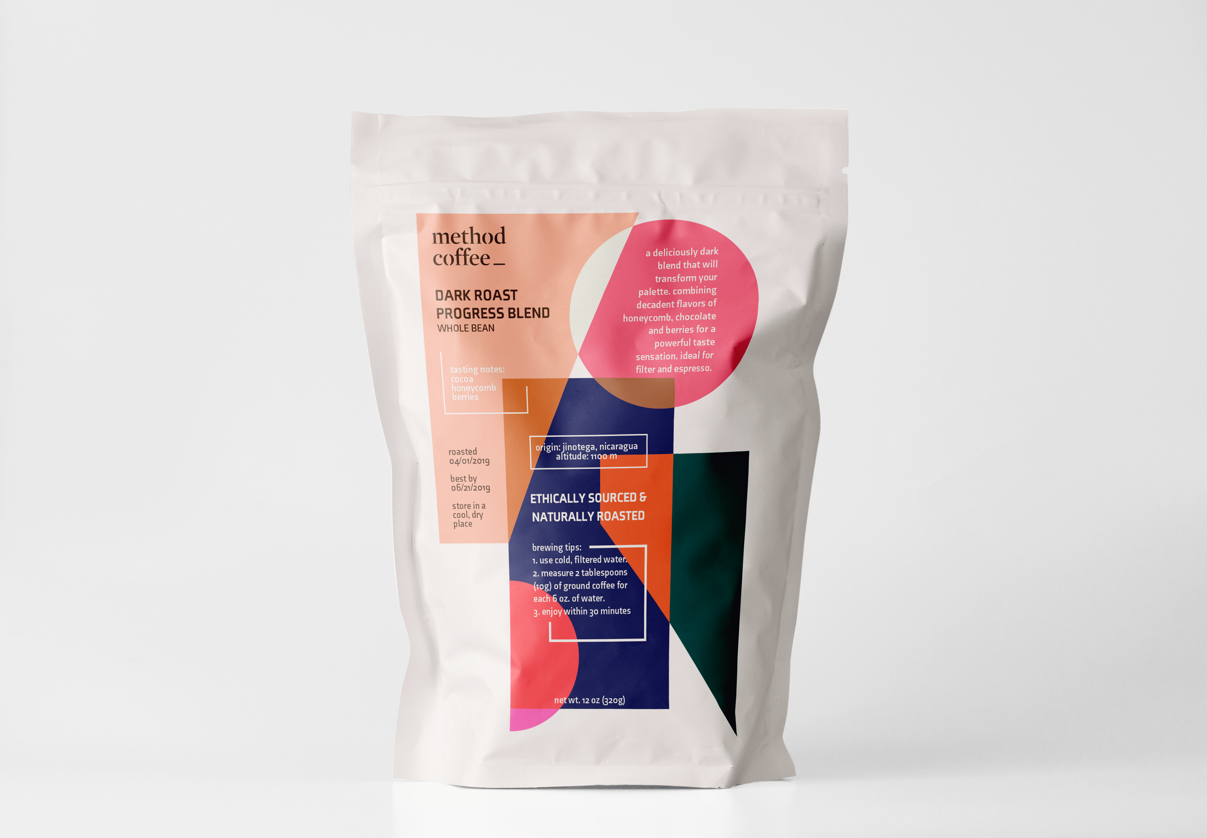
A brand targeting millennial coffee shoppers, Method Coffee called for bold colors, clean lines, and a modern typeface. For this branding project, I challenged myself to design around an exploratory color palette. Each color was selected to evoke emotions specific to the target market. Supported with color theory research, the palette elicits feelings of comfort and energy. I also focused on balance in imagery and text placement on a three dimensional object.

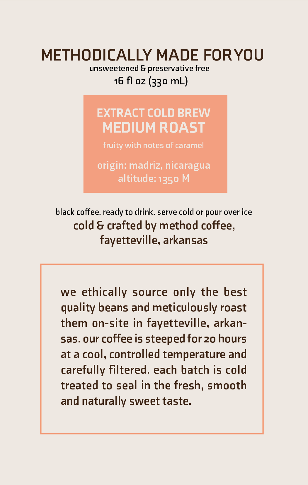
These were labels created for a cold brew bottle. Clean, simple labels mimicked the geometry of the mark. Intentional hierarchy created easily digested information for the average millennial who desires minimal information and eye-catching packaging when choosing from the multitude of coffee options on the shelf.
DECEMBER 2018